


No. 51
The VANGUARD ISSUE

ON THE COVER
Maggie Rizer wears Max Mara’s
Giorgio Coat in a 1999 photograph
by Richard Avedon. Courtesy of Max Mara.
ISSUE 51 HIGHLIGHTS: First Look Objects of Desire Body of Work On the Rise Singular Sensation Contract High See the whole issue Subscribe
hello world
OUR SINCERE THANKS TO ALL WHO MADE ISSUE NO. 51 POSSIBLE: AGS Stainless * Atelier Drome * Babienko Architects * Jenny Barnett * Baylis Architects * BC&J Architecture * Malin Berden * Jordan Berta * BjarkoSerra Architects * Amber Blackstone * Blu Dot * BoConcept * Bradlee Distributors * Stefania Canta * John Paolo Canton * Marlene Capron * chadbourne + doss architects * Chown Hardware * Francesca Colombo * Cosentino * Cove * Russell Datz * David Coleman Architecture * Jillian DeSantis * Design Week Portland * Design Within Reach * Designer Furniture Gallery * Designs Northwest Architects * Disticor * Dovetail General Contractors * Dowbuilt * Eggleston | Farkas * Emerick Architects * Ferguson * Cameron Flaherty * First Lamp * Alice Gaini *. GATH Interior Design * Lauren Glazer * Judgie Graham * Guggenheim Architecture + Design Studio * H2D Architects * Hacker * Rebecca Haines * Jamie Han * Lindsay Hanson * Melanie Heicklen * Hightower * Hive * Hoedemaker Pfeiffer * Amelia Hoke * Eric Horvitz * Hoshide Wanzer Architects * Benjamin Hubert * Hyde Evans Design * Andrea Iacopi * Janof Architecture * Élodie Jolivet * Kurt Koepfle * LA Design Festival * Sabrina Lee *. Jiaxin Lin * Olivia Lugarini * Dani Marion * Alexia Mentis * Anne Murphy * Jelka Music * Journal Graphics * One Source * Rossana Palmisano * Provenance Hotels * Ragen & Associates * Sarah Reid * Sam Riehl * Resource Furniture * Scott Robertson * Room & Board * RUFproject * Kylie Salee * Allie Saliani * Shawna (Rowan) Schmitz * Scott | Edwards Architecture * Wes Seeley * Kidessa Shattuck * SKHS Architects * Skylab * Small Changes * Emilie Smith * Kendall Smith * Steelhead Architecture * Kathryn Stenger * Stephenson Design Collective * Robert Storey. * Studio AM Architecture | Interiors * Sub-Zero * Evie Sudlow *. Nicole Swansen * The Richards Group * Morgan Theys * Amanda Trantino * Tyler Engle Architects * Ilaria Vezzoli * Virani Real Estate Advisors * WantedDesign * Kristen Weil * WeWork * William / Kaven * Lyn Winter * Wolf * Works Progress Architecture * Workshop AD * Lingjun Xu -- and to all of our subscribers.
In 2011, GRAY embarked on its mission when CEO Shawn Williams found the uncommon courage to blaze a new trail and launch the first magazine dedicated to world-class design emerging from the Pacific Northwest. At the time, it was a big risk rooted in heart, passion, instinct, and dreams.
Much has changed in the near-decade since. The world has become ever more connected, a digital cacophony speeding the flow of ideas across countries and continents to a point where design truly knows no boundaries. So now, we take another leap of faith (an act with which the vanguards featured in this issue are well acquainted) to proudly become the only international design magazine based in the region—one that cuts through the noise to spotlight the best in global design from our uniquely grounded and distinctive point of view.
We’re thrilled to be stepping onto the world stage, but as this issue attests, we’ll never forget where we came from, or our core belief in the power of design to change life and culture for the better. As such, we remain deeply committed to providing a platform for the most noteworthy work in the Pacific Northwest. Alongside the inspiring projects and people from our local community that have long defined GRAY, Issue No. 51 presents exclusive features with some of the most dynamic designers in the world today: a creative director of a famed Italian fashion house whose feminist influence extends well beyond the runway; a groundbreaking graphic designer who has forever altered New York City’s visual landscape; the chief design officer of a revered Swedish automotive company that is pushing the bounds of sustainability; and an architect merging the fields of biology, artificial intelligence, and materials science.
These stories bring to light the perpetual exchange of ideas that occurs across disciplines, a vivid reminder that the lines between architecture, interiors, design, and fashion aren’t black and white—they’re GRAY. In the months to come, we will continue to explore the spaces in between and look forward to sharing the adventure with you.
As we go to press, the world is changing in ways few of us could have imagined, with our industry—and society at large—confronting a watershed moment. We sincerely hope this issue will help to provide a sense of optimism and, at the very least, a momentary escape.
In solidarity,
Your friends at GRAY
BACKSTAGE
PASS
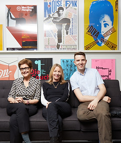
ilar Viladas, acclaimed design writer and editor, says of her story on graphic designer Paula Scher: “I’ve interviewed many design world luminaries, but after I read about Paula Scher and previewed her new book on her long-standing collaboration with the Public Theater, even I was intimidated. I needn’t have been. Scher is down-to-earth and straightforward, with a combination of self-deprecating humor and self-assuredness. It was fascinating to hear her talk about her work, and her obvious passion for what she does.”
Feature photographer Christopher Garcia Valle captured Scher at her Pentagram offices and says: “Meeting Paula Scher was a real treat. She greeted me with a warm smile, and we were quick to get started. After shooting inside, we made our way outside, where Paula pointed out a logo she designed for a nearby business. I asked what it felt like to see her work displayed publicly. She explained that it doesn’t faze her much now, but that it still feels important as an acknowledgement that she’s contributed to our cultural landscape in some way.”
INTEL
FIRST LOOK

Courtesy Lelièvre Paris
Evoking earth, sea, and sky, Jean Paul Gaultier’s new Un Monde Parfait—or, A Perfect World—wall coverings collection for textiles house Lelièvre Paris is a vivid exploration of nature in all its fantastical forms. Comprising 10 prints, the designer-led journey begins deep below ground with Magma and eventually culminates in Étoiles, the stars. “Everything that is around me inspires me, but when I’m working on interiors, the starting point is often something I have presented for the Haute Couture shows,” Gaultier tells GRAY.
Replicating the organic elegance of shagreen, Précieux, shown here, is embossed with the texture, pattern, and distinctive spine detail of stingray hide naturally eroded by waves and time. “I call it morphing, like a trace or an impression of something that was there for a fleeting moment,” Gaultier explains. “I love the visual but also the tactile—both are of equal importance.” Available through Scalamandré in the US. —Matthew Dakotah

Courtesy Renzo Piano; Giovanna Giusto
BRIDGING
THE FUTURE
After tragedy, Renzo Piano designs a new bridge for his hometown.
By Rachel Gallaher
On the morning of August 14, 2018, after heavy rain hit the northern Italian port city of Genoa, a section of the 1960s-era Morandi Bridge, a key viaduct spanning the Polcevera River, collapsed, sending dozens of cars hurtling onto railroad tracks below. The tragedy, traced to the failure of a set of the bridge’s stays, caused 43 deaths and dozens more injuries and deeply wounded the city’s civic pride. So, when it was announced just three months later that Genoa-born architect Renzo Piano had offered to design the replacement bridge free of charge, hope reverberated through the community.
With a streamlined and minimal form that seems to float in midair, the new steel-and-concrete structure is slated to open to traffic this summer. Steel elements are powder-coated in white to harmonize with the surrounding landscape, while seamlessly integrated photovoltaic panels power all systems, including lighting and sensors. “The new bridge must be simple and straightforward but not ordinary,” says Piano. “It is going to look like a ship moored in the valley. During the day, it will reflect sunlight and absorb solar energy, and at night, it will return it. It will be a sober bridge, respecting the character of the Genoese.”


FROM TOP: Architectural rendering of the building’s xterior. Architect Tadao Ando.
UPWARD
SPIRAL
Tadao Ando's latest museum design is a lesson in spatial awareness.
The recently completed He Art Museum (HEM), in the Shunde district of Foshan, in southeastern China, is a hallmark example of Pritzker Prize-winning Japanese architect Tadao Ando’s celebrated work. Lauded for his balance of simple forms and complex spatial circulation, poetic use of natural light, and stunning minimalism, the self-taught Ando has risen to the occasion once again with this modern art museum, which is slated to open this summer, though may be delayed due to the pandemic. Designed with an asymmetrical profile, the more than 170,000-square-foot building comprises four stacked spherical levels with a double-helix spiral staircase at their center. The pure, fluid lines of the structure nod to HEM’s founding philosophy, which emphasizes balance and harmony. Visitors will enter the museum via a walkway that cuts through a tranquil water feature—another vital element
of Ando’s nature-centered style. —RG
.jpg)
BODY TALK
Conventional Western beauty standards bore Belgian costume designer Jennifer Defays, so she’s spent the past two decades creating ensembles that accentuate and morph the body in unexpected ways. Defays presented her newest work at Brussels’s TicTac Art Centre in MUTE, an exhibition that highlights her use of costume to explore societal stigmas and oppressions. Featuring haunting cotton masks with protruding artificial cheekbones and her provocative Window Dress series—designed like targets, with circular openings at the pelvis, the works denote prostitution and the patriarchy’s narrow gaze on the female figure—MUTE is a layered multisensory experience that explores the stifling of self-expression, incorporating recorded shouts and cries as well as text by writer Natalia Dusfraise. “My definition of costume is a crafted work on the human body,” Defays tells GRAY. “It’s like a sculpture, and it opens a lot of possibilities.” —Claire Butwinick

HOUSE BEAUTIUL
California-based architect Scott Mitchell’s landmark residences are characterized both by what they renounce (excessive opulence) and what they embrace (purity of form and space). Informed by Japanese minimalism and Shinto aesthetics, Mitchell’s works are fusions of rich organic materials, sculptural concrete, and seamless connections to the natural landscape. In May, Rizzoli debuted the book Scott Mitchell Houses, a charting of the architect’s design trajectory from a modern interpretation of an 18th-century farmhouse to the monumental Malibu estate seen in Tom Ford’s 2016 film Nocturnal Animals. The book includes a foreword by architectural critic Paul Goldberger and contributions from longtime friend Calvin Klein. “I am most happy with the way that the book conveys, through the voices of contributors and friends, the emotional impact of what I aspire to create in my work,” Mitchell tells GRAY. —CB

TACTILE ILLUSIONS
“I always had a sensitivity for images and a fascination with moving images. On the other hand, I studied furniture design,” says Netherlands-based designer Audrey Large, who unites her design background with cutting-edge cinema technology in her creation of fluid, otherworldly sculptures. Initially hand-sketched on a tablet and then printed on paper and 3D-printed with polylactic acid and an iridescent sheen, Large’s works explore the boundaries between digital and analog objects. Implicit Surfaces, her latest installation, debuted at Milan’s Nilufar Gallery, features seven new sculptures as well as a CGI animation projection, expanding on Large’s earlier interrogations of the slippage between the real and the (deep) fake.
—LRB, CB
OBJECTS OF DESIRE
Imagined by Norwegian designer Stine Aas for Dims., the stackable Cleo chair (shown here in fjord blue) is inspired by archways and decorative motifs in classical architecture.
lounge act
Sit back, relax, and enjoy the best of what’s new in seating.
Designed by Karim Rashid for BoConcept, the soft curves and restrained colorway of the Chelsea sofa (shown in mustard cotton-velvet fabric) nod to the designer’s signature style, which he calls “sensual minimalism”; Roche Bobois’s Odea armchair, created by Italian designers Roberto Tapinassi and Maurizio Manzoni, evokes the petals of a blooming flower; The marshmallow-esque Pukka sofa by Ligne Roset pays homage to Gaetano Pesce’s 1969 collection UP50; The seat of Industry West’s Sable armchair (shown in Moss 59) is wrapped in hand-painted water-buffalo leather or velvet, and cantilevers on a powder-coated black or brass-plated steel frame; The Bloke 60-inch sofa from Blu Dot (shown in ochre velvet) appears to hover over its thin, powder-coated steel legs.


DESIGN DNA
BODY OF WORK
AUTUNNO INVERNO 1998-99 FOTOFRAFATA DA RICHARD AVEDON
American model and activist Maggie Rizer wears the Giorgio Coat in a 1999 photograph by Richard Avedon—one of countless iconic ad campaigns produced by Max Mara since its founding in 1951. Creative Director Ian Griffiths often refers to the storied Italian fashion house as “classic but not conservative,” a description perfectly captured in this timeless moment.


EMPOWER
HOUSE
Avant-garde sophistication, classics that meet the moment, and a highly elegant form of feminism make Max Mara a singular force in fashion—
decade after decade.
By Lauren Gallow and Matthew Dakotah
Wearing a trench coat of virgin wool and cashmere, a model commands the runway with a confident stride at Max Mara’s Spring/Summer 2020 fashion show at Bocconi University in Milan.
Images courtesy of Max Mara
S
tunning supermodels, front-row celebrities, famous photographers, iconic ad campaigns, dramatic statement stores in creative capitals across the globe—all in celestial orbit around beautifully rendered, covet-worthy clothes that transcend short-lived seasons. As a revered Italian fashion house, this is precisely what one might expect of Max Mara. But perhaps more surprising, and brand-defining, is what lies just beneath the beauty and buzz—a decades-long feminist whisper that has steadily grown to an all-powerful roar.
To explore this long arc of challenging conventions and the nuanced role it plays in Max Mara’s design DNA, GRAY sat down with Creative Director Ian Griffiths and Worldwide Communication and PR President Giorgio Guidotti, on the eve of their Fall/Winter 2020 show in Milan.
“For me, it’s separating the concept of classicism from the concept of conservatism,” Griffiths says. This simple statement encapsulates the fascinating duality at the heart of Max Mara. The brand has led a steady march toward gender equality since its founding in 1951, but through an elegant insistence rather than a flashy ultimatum. “When Achille Maramotti established the company, he was identifying women in the workplace as the future,” Griffiths continues. “His idea was that these were clothes for women to engage with the world and change the world. And if you’re setting out to change the world, you don’t wear experimental clothing. You wear clothing with its roots in classicism. That doesn’t mean that your gender, as a woman, is a conservative one.”
Far from it, Griffiths explains. “The idea of female empowerment was very much at the forefront of Achille’s thinking; he was a real radical. But at the time, the very word feminism was associated with a kind of dangerous political world that was not discussed in polite society. Now we can declare it.”
For the past seven decades, Max Mara has been the force behind some of the movement’s most influential power uniforms, each armed with an impeccably tailored coat. And since joining the company in 1987, Griffiths has faith-
fully carried Maramotti’s trailblazing career woman into the future with collection after collection that achieves an effortless sophistication, at once timeless and contemporary.
Although Griffiths is obviously proud that Max Mara took the lead in defining “a dress code that gave women access to the corridors of power,” he doesn’t see it so much as a uniform now. “In the time that I’ve been at the company, I’ve noticed how women have come to expect and demand the right to express themselves, even at work,” he says. “When they walk into a room, they want to announce themselves; they want to announce their success and their power. And quite rightly so.”
continued below »

A look from Max Mara’s Pre-Fall 2020 collection, arriving in stores now. The cotton T-shirt features an iconic Weimaraner image by American artist William Wegman.
Creative Director Ian Griffiths’s mood board for the Pre-Fall 2020 collection. “The concept was initiated by an exhibition I saw in London of Holly Solomon’s collection, the New York gallerist. It reminded me of her enormous contribution to the art scene in the 1970s and ’80s and how she nurtured artists like Lichtenstein, Mapplethorpe, and Laurie Anderson,” Griffiths says. “I imagined a downtown New York scene sometime in the late 1970s, where all of Holly Solomon’s protégés were partying with the likes of Jagger and Debbie Harry.”


"THE IDEA OF FEMALE EMPOWERMENT WAS VERY MUCH AT THE FOREFRONT OF [MAX MARA FOUNDER] ACHILLE MARAMOTTI'S THINKING: HE WAS A REAL RADICAL. BUT AT THE TIME, THE VERY WORD FEMINISM WAS ASSOCIATED WITH A KIND OF DANGEROUS POLITICAL WORLD THAT WAS NOT DISCUSSED IN POLITE SOCIETY. NOW WE CAN DECLARE IT." —IAN GRIFFITHS

LEFT: A silk taffeta shirt with ruche detail and long velvet skirt with rounded splits grace the runway at Max Mara’s Fall/Winter 2020 show. BELOW: An installation at Max Mara’s 2017 Coats! exhibition in Seoul, which was designed by Migliore+Servetto Architects. Spanning 60 years of Max Mara history, Coats! reflected the changes in tastes, lifestyles, and societal norms that have defined each decade. Continually reimagined, the traveling exhibition has also been presented in Moscow, Beijing, Tokyo, and Berlin.


"FIRST WE TRY TO FOCUS ON THE WOMAN, AND OF COURSE THE THEME OF THE COLLECTION IS VERY IMPORTANT. WE ARE VERY STABLE AND FOCUSED AND GET TO WORK WITH THE BEST OF THE BEST. BUT IT'S A WORK IN PROGRESS. I'M NOT STAYING STILL." —GIORGIO GUIDOTTI
It’s a subtle shift, but one that illustrates the brand’s attunement to the ways that fashion can reflect—and in the best cases, help drive—positive change in social mores. And that evolution is evident in what Griffiths has been sending down the runway. “What I’ve been working on over the last 10 years or so is discovering a slightly edgier interpretation of classics,” he says. “Everyone knows I come from this English 1970s/’80s punk background, and I’ve been injecting a little bit of that because the Max Mara woman is far from conservative. She’s out to change the world for the better.”
To celebrate the power of femininity and bring his collections fully to life, Griffiths has found one of his closest creative conspirators in Guidotti, who has also shaped the public face of the brand since the 1980s. The mind behind some of fashion’s most memorable moments, Guidotti has produced countless ad campaigns with acclaimed photographers such as Richard Avedon, Arthur Elgort, Steven Meisel, and Mario Sorrenti. “I’ve been lucky to work for many years with Ian, who is a great partner in terms of defining the brand—when I’m in Italy, every morning I have coffee in his office,” Guidotti says. “First we try to focus on the woman, and of course the theme of the collection is very important. We are very stable and focused and get to work with the best of the best. But it’s a work in progress. I’m not staying still.”
Aside from dressing the self-possessed career woman, Max Mara has long used its privileged position to amplify women’s creative voices around the world. In 2005, the company partnered with Whitechapel Gallery in London to establish the Max Mara Art Prize for Women, a biannual award supporting a UK-based female artist with a six-month residency and two major solo exhibitions. It’s a belief in the close relationship between art and fashion that began with Maramotti’s avant-garde art collection (now open to the public at the company’s original headquarters in Reggio Emilia) and continues through such collaborations as the Max Mara Whitney Bag, originally designed in 2015 with the Renzo Piano Building Workshop to commemorate the firm’s new downtown Manhattan building for the Whitney Museum of American Art. Not surprisingly, the bag’s fifth-anniversary edition is dedicated to American modernist painter and feminist Florine Stettheimer, who, along with museum founder Gertrude Vanderbilt Whitney, Griffiths fondly describes as “strong, formidable women who demanded things on their own terms.”


Beyond the Whitney Bag, Max Mara’s intimate connection to art has long weaved its way into Griffiths’s work—most recently the Pre-Fall 2020 collection, which is arriving in stores now. “It was initiated by an exhibition I saw in London of Holly Solomon’s collection, the New York gallerist, who was a great friend of Giorgio’s,” he explains. “Giorgio’s introduction to Holly opened up a whole world of experience, and this exhibition reminded me of her enormous contribution to the art scene in the 1970s and ’80s and how she nurtured artists like Lichtenstein, Mapplethorpe, Nam June Paik, Laurie Anderson, and Mary Heilmann. At the same time, Debbie Harry’s autobiography came out and was another reminder of those years. It was a moment that Giorgio and I lived, and Max Mara really identified with.”
At a time when the fashion industry, and Western business at large, is clamoring to take the mantle of female empowerment, Max Mara stands as a brand that’s been deeply—and uniquely—engaged from the start. It’s a legacy that Griffiths and Guidotti don’t take lightly. “I never finish what I’m doing,” Griffiths says. “There’s always that moment, a night or two before a show, where I have huge doubts about what I’ve done. I think that’s a natural part of the creative process. The point at which you don’t think, ‘Oh, my God, this is the worst thing we’ve ever done!’ is the moment when you don’t care anymore, and so it’s the moment you stop doing it.”
Thankfully, neither Griffiths nor Guidotti appears to have lost an ounce of interest in their long-loved brand. “It’s still exciting. I’m not going to retire anytime soon,” Guidotti says. “I’m having a fun time doing it,” Griffiths adds. “If you have a look at my Instagram account, my most frequently used hashtag is #ilovemyjob.”
ABOVE, LEFT: Backstage at Max Mara’s Spring/Summer 2020 show. Joanna (center) wears a bomber in silk twill. ABOVE, RIGHT: The Max Mara Whitney Bag’s fifth-anniversary edition debuts in April. Originally designed in 2015 with the Renzo Piano Building Workshop to commemorate the firm’s new downtown Manhattan building for the Whitney Museum of American Art, the 2020 version is dedicated to American modernist painter and feminist Florine Stettheimer.

Courtesy Tolu Coker and O.G Studios
BODY OF WORK
CULTURE QUAKE
Nigerian-British designer Tolu Coker explores identity, community, and lived experience through fashion, film, and rich visual narratives.
By Claire Butwinick

Coker with her models for
Juvenile Consciousness.
FOR LONDON-BASED DESIGNER TOLU COKER, FASHION DOESN'T START OR END WITH AESTHETICS. Instead, it’s a portal to socially conscious storytelling. Since 2018, she has captivated the fashion world with her breakout eponymous clothing label, expressing her African diasporic identity through youthful yet politically aware collections. At the same time, Coker has asserted black visibility in other media, creating commissioned illustrations for the Tate Modern, celebrating African beauty and the Black Panther movement in a series of collages for H&M and Loewe, and challenging Eurocentric viewpoints with her in-depth documentaries and fashion films. And at 26, she’s just getting started. “I think about the way in which narratives are written, who controls narratives, and what they’re trying to portray—not just in fashion but in society in general,” she tells GRAY. “Identity and narrative are things that I’m always questioning in my work.”
A recent graduate of London’s celebrated Central Saint Martins fashion school, Coker first sparked international buzz with her 2017 premier collection, Replica, an intimate exploration of her African heritage and British upbringing. Her creative process was groundbreaking: rather than ruminate introspectively in sketchbooks and mood boards, Coker spent a year filming the lives of four African-diaspora youths in London and Paris, whose experiences then influenced her designs. Asked why she employed this unconventional method, Coker replies with another question: “Fashion is such an identifying tool for us, so why doesn’t it reflect real people’s stories more?” Comprising seven genderless looks, the collection included leather jackets hand-painted with faces from her muses’s family photos, hip-hop-inspired patchwork denim overalls, bedazzled boomboxes, and an upcycled sheer lace gown with an illustration of one of the muses, Ayishat, adorning the back of its detachable train. The recipient of the coveted Vogue Talents Award, Replica was embraced by celebrities such as Rihanna and Rita Ora and appeared in a film for Vogue Italia that Coker codirected.

ABOVE: “Replica isn’t going to represent every single person,” says Coker. “But through the documentary, I saw people’s very distinct differences, but also so many similarities. Even though that collection was designed around four real people, many people messaged me after the show saying, ‘I really connected with that and I could see it in the clothing.’” RIGHT: The finale of Coker’s sophomore collection, Juvenile Consciousness, included a sheer dress made of deadstock fabric, accessorized with a Nigerian-inspired headpiece fashioned from discarded belt buckles, bolts, and old jewelry.

Storytelling also guided Coker’s 2018 sophomore collection, Juvenile Consciousness, but this time, she dove into her own family history, particularly that of Kayode Coker, her Nigerian-born father, a British Black Panther in the 1960s who documented the movement in photos, diary entries, and memorabilia. “People always think about the Black Panthers as a political movement, but I grew up knowing it as a community movement,” she says. “The American sector of the
Black Panthers started out in soup kitchens. It was about feeding the community before it was about disrupting the establishment, which subjugated these communities and marginalized them.” Honoring her father’s legacy, she adapted his photographs into illustrations on deadstock leather jackets, pairing them with denim crop tops and wide-legged pants, which were upcycled from old jeans supplied by Coker’s neighbors and friends. Each look was accompanied by intricate handmade Nigerian tribal– inspired headpieces constructed from broken buckles, bolts, and old earrings sourced from Japanese factories.
With each collection, Coker designs wearable protests that promote holistic black representation in a culture that all too often fails to portray people of color with accuracy or depth. Her work not only creates space for marginalized groups, but also holds up fashion as a mechanism for social change. Last fall, Coker put the power of fashion activism to the test when she teamed up with African fabric manufacturer Vlisco to design graduation outfits for members of the City of Joy, an organization in the Democratic Republic of the Congo that empowers women who have survived gender violence. “Through that project, in our small way, we were actually changing the world,” she says.
This year, Coker and her brother, Ada Coker, are creating a film project in Nigeria, titled Masqueraded Memoirs, which she hopes will inform her next collection. At the same time, she is earning her postgraduate certification at Central Saint Martins and lecturing other, younger students to help diversify the fashion industry and hold the door open for emerging black designers in the process. “When you build leaders around yourself, you build a legacy,” she says. “You build something that outlives you.”

Groundbreaking graphic designer Paula Scher, photographed by Christopher Garcia Valle for GRAY at Pentagram’s New York headquarters on February 13, 2020. A longtime partner at the firm—the world’s largest independently owned design studio—Scher is marking yet another career milestone with her new book, Paula Scher: Twenty-Five Years at the Public, A Love Story, which debuts in April.
THE VANGUARDS
SINGULAR
SENSATION
NEW YORK NEW YORK
Arguably the most influential graphic designer of her generation, Paula Scher has shaped the visual and cultural landscape of New York one exuberant word at a time.
By Pilar Viladas
Portrait by Christopher Garcia Valle
Images courtesy Pentagram
n Gary Hustwit’s 2007 film Helvetica, about the ubiquitous modernist typeface, graphic designer Paula Scher recalled that when she studied at Philadelphia’s Tyler School of Art in the 1960s, a teacher suggested that instead of applying ready-made type to an illustration, she should illustrate the type itself. As a result, she recalls, “I realized that type had spirit and could convey mood, and that it could be a broad palette to express all kinds of things,” a revelation that helped shape her subsequent, now five-decade-long career.
Scher, who in 1991 became the first woman partner in the renowned design firm Pentagram, has built a legendary résumé that includes iconic album covers and book jackets as well as identities for commercial clients from Citibank to Shake Shack and for New York cultural institutions such as the Museum of Modern Art, the High Line, Jazz at Lincoln Center, and the Metropolitan Opera. Even the New York City
Department of Parks and Recreation uses Scher-designed graphics. She once covered the exterior of a performing arts center in Newark, New Jersey, in large-scale all-caps words: THEATER. DANCE. MUSIC. In the 2017 Netflix series Abstract: The Art of Design, Scher said, “Typography is my biggest high.”
Scher’s numerous awards include the AIGA Medal and a National Design Award from the Cooper Hewitt, Smithsonian Design Museum. Michael Bierut, one of Scher’s partners at Pentagram, says, “Paula is, to a remarkable degree, an uncompromising artist. I’ve never met anyone in our field who is so ill at ease with repeating herself.” At the same time, he says, “she’s one of the most articulate people in the world at explaining things.” Pentagram’s own website says Scher “straddles the line between pop culture and fine art in her work,” creating images that have “entered into the American vernacular.”

For nearly three decades, Scher’s environmental graphics for the Public Theater have appeared across New York City, including the 1996 Times Square billboard pictured here.


"I REALIZED THAT TYPE HAD SPIRIT AND COULD CONVEY MOOD, AND THAT IT COULD BE A BROAD PALETTE TO EXPRESS ALL KINDS OF THINGS."
—PAULA SCHER
One of the best-known examples of these images is the subject of Scher’s new book, Paula Scher: Twenty-Five Years at the Public, A Love Story, coming in April from Princeton Architectural Press. It chronicles her remarkably long relationship with the Public Theater in New York, in which Scher revolutionized the way a cultural institution presents itself by making type the dominant force in posters, programs, and other printed forms of communication. “I wrote the book for designers,” she says. “All of us make pronouncements about how identities are going to be, but you have no idea. I had to invent it as I went along,” which may be why she calls the Public “my R&D.” In an essay in the book, Ellen Lupton, Senior Curator of Contemporary Design at the Cooper Hewitt, says, “It’s a story about how graphic design really happens.”
Graphic design started happening for Scher even before she knew what it was. She made posters for school proms and football games as a teenager, but “didn’t think about graphic design as a separate activity.” At Tyler, Scher, who thought she would be an illustrator, realized that graphic design “was about problem-solving,” something she realized was far more compelling. And there was that fateful epiphany about type. Once out in the world, Scher worked for Atlantic Records as a designer, and later for CBS Records as an art director. There, she designed album covers and posters for the series The Best of Jazz which anticipated her early work for the Public Theater and, to her chagrin, art-directed Boston’s 1976 self-titled debut album, which featured a guitar-shaped spaceship. Scher recalls in her 2002 book Make It Bigger that a friend at CBS predicted that “art director of the original Boston album” would be her epitaph. “The thought has always horrified me,” she writes. But, when interviewed years later for a project with a big technology company, Scher—with characteristic savvy—mentioned the Boston cover. “I felt a hush of reverence permeate the room,” she says, and she got the job.
After leaving CBS in 1982, Scher went out on her own, eventually founding Koppel & Scher with Terry Koppel, a classmate at Tyler, before joining Pentagram less than a decade later. She was its sole female partner for 10 years, but being part of the company gave her access to clients she might not otherwise have had. Now, she says, things are better for women: “I used to try to make men think that women were really good designers,” a task that she recalls as impossible. “You can get them to respect you for who you are and what you do, and in that way, you’ve changed them.”
It was at Pentagram that Scher was approached in 1994 by George C. Wolfe, the director of the Public, which was famed for its work by new playwrights, its staging of popular hits such as Hair and A Chorus Line, its acclaimed productions of Shakespeare, and its illustrated posters by Paul Davis. Wolfe enlisted Scher to help convey the message, as he says in the new book, “that the institution was becoming expansive and inclusive and intensely vibrant.” Her response—to overhaul the theater’s visual identity by making “Public” its logo and by using big, in-your-face type rather than illustrations—was startling. When Scher presented the graphics at one of Pentagram’s international partners’s meetings, some of her colleagues from the London office walked out.
ABOVE, LEFT: Scher has designed posters for more than 100 Public productions, including this one from 1994. ABOVE, RIGHT: Scher’s large-scale installation for Planned Parenthood’s national headquarters in Lower Manhattan includes a mural that remixes a century of the organization’s ephemera as it ascends the main staircase.


RIGHT: Environmental graphics for Bloomberg LP headquarters, Midtown Manhattan.

BELOW: A satirical promotional campaign for women’s body care brand Flamingo.


Wolfe calls Scher’s graphic design for the 1995 musical Bring in ‘da Noise, Bring in ‘da Funk—which featured large photos of a dancing Savion Glover surrounded by multidirectional type—“Paula’s most joyfully aggressive work.” The images appeared all over New York, Wolfe says, and “Noise/Funk, the city, and the Public had visually become one.” Since 2005, Scher has worked with Oskar Eustis, Wolfe’s successor as artistic director, on productions including Gatz, Here Lies Love, and the blockbuster hit Hamilton, all the while evolving the theater’s graphics, aided by her own and the Public’s in-house design teams.
Among her many current projects, Scher is redesigning Jazz at Lincoln Center’s logo. “I love when they come back and want to redo it,” she says. Her work beyond the sphere of the arts includes the new lobby of Le Méridien Dania Beach Hotel in Fort Lauderdale, featuring an inlaid terrazzo floor that is a giant map of the city. And, working with the landscape architecture and urban design firm James Corner Field Operations, she has designed a new identity and signage for the Nicollet Mall in Minneapolis, the nation’s first transit mall.
In her spare time, Scher spends weekends painting large-scale, information-and-commentary-rich maps—of cities, states, and continents, of a type that she’s made since the 1990s—at the Connecticut weekend house she shares with her husband, Seymour Chwast, the graphic design icon who cofounded Push Pin Studios with Milton Glaser and Edward Sorel. “He works all weekend. That’s why I started painting,” she quips. (Actually, childhood tests revealed that Scher, a mapmaker’s daughter, had a gift for quantitative reasoning.)
And she shows no signs of slowing down. In the Netflix series, Scher says, “Making stuff is the heart of everything. What can I make next? I’m driven by the hope that I haven’t made my best work yet.”


Peter Mauss/Esto
Peter Mauss/Esto


Cover and inside spreads of Scher’s new book, Paula Scher: Twenty-Five Years at the Public, A Love Story, a behind-the-scenes look at her longstanding collaboration with her first major client as a Pentagram partner.
“PAULA IS, TO A REMARKABLE DEGREE, AN UNCOMPROMISING ARTIST. I’VE NEVER MET ANYONE IN OUR FIELD WHO IS SO ILL AT EAST WITH REPEATING HERSELF.” —MICHAEL BIERUT
LAST CALL
CONTRACT HIGH

Courtesy Laurian Ghinitoiu
Continuing the legacy of the late Zaha Hadid—the Pritzker Prize–winning architect dubbed “Queen of the Curve” by the Guardian in 2013—Dubai’s recently opened Opus building makes a compelling case for unconventional architecture. Located in the city’s stylish Burj Khalifa district and designed by Hadid’s eponymous firm, Opus is an ambitious mixed-use project holding
12 restaurants, a nightclub, extensive office space, and the first Middle Eastern branch of ME by Meliá Hotels. The eight-story amorphous void carved through the building’s center is spanned by a three-story bridge connecting the two main towers, and every space features commanding views of the surrounding city. The darkened façade, enveloped in UV-protective frit-pattern glass, reflects the expansive skyline. ZHA’s project director for Opus, Christos Passas, tells GRAY that the structure reflects Hadid’s “unwavering optimism [about] the future and belief in the power of advanced design, material, and construction.” —LRB, CB
Read through the whole issue in digital format below, or purchase the print edition here.
Note: Due to COVID-19, we've unlocked the digital version for cover-t0-cover reading; and we've reduced subscriptions 50%.