Balancing modern architecture with historic reference, Lumsden Design creates a space to explore at M+ Shop.
By Rachel Gallaher

The M+ Shop, at Hong Kong's recently opened M+ museum.
In 2017, Lumsden Design started to envision the interiors for M+ Shop, a ground-floor retail space at the M+Museum of Visual Culture in Hong Kong, which opened at the end of last year. Located in a new Herzog & de Meuron–designed building on the edge of Victoria Harbour, the 9,600-square-foot M+ Shop reflects its architectural parent and the contemporary works housed within those walls.
“Our approach was to use the space to provide more than a shopping experience for its customers,” says designer and firm founder Callum Lumsden. “We created a retail environment that refers to the collection, its artists and creators, and enables the retail team to embrace the spirit of the museum as an integral part of the visitor’s journey. [The museum] represents a major initiative to bring contemporary culture to Asia, and it was essential to translate this into a local context as well as stand out in an area rapidly filling with creative spaces.”
The museum stands in the West Kowloon Cultural District, which is rich with arts venues and shopping options, so “it was important to achieve wider appeal as a destination shop to stand out in one of the biggest retail centers on the planet,” Lumsden says. Even though it’s attached to the museum, the goal was to design a shop that would be appeal beyond that context, so Lumsden turned to local culture for inspiration.

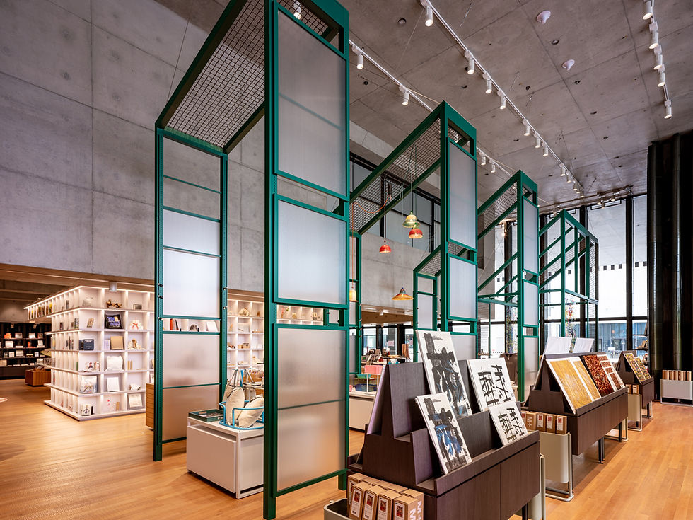
The form of the tall structures at one side of the shop are inspired by the traditional food stalls found in Hong Kong markets.
“We gathered a comprehensive history of the city,” he says. “This allowed us to capture the bustling feel of the local market stalls. A key element of the design was inspired by Hong Kong’s traditional dai pai dongs (food stalls).” In one area of the space, customers can pass under a row of narrow, nearly-10-foot-tall steel-and-frosted-glass structures that nod to these beloved market stalls.
Working in a Herzog & de Meuron building, Lumsden also looked to match certain intangible elements of the architecture firm’s design “by invoking the feeling of activity and surprise,” he explains. “[We used] a combination of contrasting colors (inspired by a popular Chinese soap opera!) and mixed unusual materials and structures that contrast with the stark architectural vision. We believe that, alongside Herzog & de Meuron, we have achieved a character and spirit to the retail proposition which will delight and surprise visitors.”

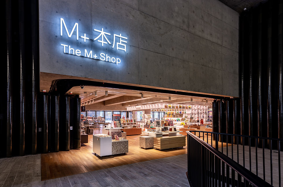
The shop is located in the Herzog & de Meuron–designed museum, but it is also accessible from the street, helping to connect the retail experience to the larger neighborhood.
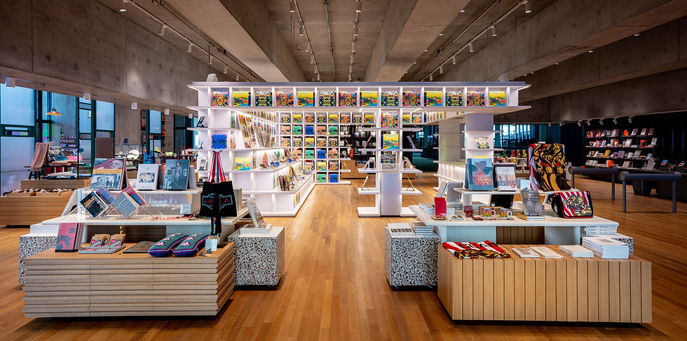
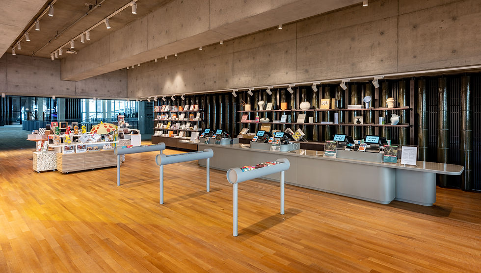
Wooden floors and concrete ceilings strike a balance that anchors the space in a minimal palette. Additional materials found throughout include blackened steel, pigmented cement, frosted resin, and terrazzo with wood chips and stained oak—a palette that keeps things visually interesting while allowing the merchandise to take center stage.
Although the shop has an open-format layout, there are distinct zones within, including the market-stall installation. At the center of the room stands a large, white shelving unit, the ‘Discover Myself’ zone, designed as a flexible pavilion that combines seating for events and artist workshops with merchandise display. Constructed with translucent resin that is lit from within, this feature is a popular draw—new discoveries sit in each nook and cranny, an idea found throughout the shop, and the museum, at large.

A mix of architectural materials create a strong background for the boutique's art-and-design-forward products.